I collected the results of my short survey which I did on the website survey monkey and here are the results that I got;
for the first question i ask the public how often do they watch music channels, and the answer were often, not often, sometimes and never. By asking this question, it helped me know rough how often people watch music channels and most of people that took the survey often watch them. This is benefit because it lets me know that If i do make an ident it will possibly become try successful, due ratings.
On the second question I ask the public how old they were, so I can know what the ident can relate to to the particular age group that was most chosen. Most people that took this survey was aged between 15 and 18. So to create this ident I could make it for that specific age group.
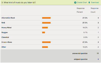
For the last question I asked what type of music do they listen to. As you can see it is fairly close between all of the answers.So i will have to even it out when it comes to actually who i am going to design the Ident for.
Tuesday, 25 September 2012
Monday, 24 September 2012
Task One – Audience and Market Research
For this task I am going to come up with different methods of research to find out who my target audience is gonna be for my music channel Ident which is going to be called 'VIBE'.
By doing this I am going to have to ask the members of the public different kinds of questions or one on one interviews with people so I can get detailed answers.
Here are at the different types of methods I am going to use;
By doing this I am going to have to ask the members of the public different kinds of questions or one on one interviews with people so I can get detailed answers.
Here are at the different types of methods I am going to use;
- Survey Monkey.
- One on one interview's.
- Gather ideas from different music channel websites.
Here is the survey monkey that i created that which will give me a rough idea of what kind of style my ident will be when I create it. If you just click onto the link below you will be able to do the survey.
Friday, 21 September 2012
Task 3: Understanding the design of a suite of television idents
What is a suit of indents ?
A suit of indents is different designs and clips or music for the same channel ident. Each one is linked by a different theme.They can have different types of audiences for example young people, or more for middle ages people. These themes could be important events going on in society or the the whole world such as Christmas. or just different seasons such as summer, spring and winter.Also they could have different indents for different times of the day, such as morning, midday or night time.
Most indents that are on in the morning tend to be more relaxing than exciting or fun, to match the mood of the viewer and for the midday it can be exciting and at night time more relaxed or can be more for adults as the shows and programmes change when it becomes late.
Different BBC one Idents
I am going to show you and explain the different types of idents for this particular Channel which is BBC one. During all year round the idents of BBC one change due to different events or different times of the year. Here are some different idents;

- Here as you can see is a Ident which relates to Christmas. In this ident you can see that there is snow and people dressed up in winter clothes, and many christmas trees. This would instantly remind the viewer that it is christmas and this makes the ident for the christmas period very successful.
- Here is a ident which relates to the London 2012 olympics. In this ident there is the famous olympics logo and this shows us that the BBC is going to be Broadcasting the games. This ident is very eligent and simple.
- This here is a sports related idents, there are many of these idents, and they change every year to refresh and keep the channel new and more interesting.
As you can they are similar to the size of the font and the colours, if you look at the first and third one, the font is the same but just layer out different due to the design of the indents, background. This has to be thought out because if there is a background that has the same colour as the font colour you would not be able to see the font, so they have to take this into consideration.
Two different music channel indents
I am going to choose two different music channel indents to how much information they are giving to the viewers that are watching the channel. How long they are on screen for, what the onscreen tempo is, how it interacts with the viewers and Whether it is information-led or entertainment led. These two channels are 4music and VIVA.
VIVA
As you can VIVA have chosen a very eye catching colour scheme in which if you were to see the colours again you would instantly remember VIVA. The pink and green colours have never been used before so this is a good way of getting noticed.
It does not give out much information but you will know it is for the music channel that they have. You can see that the slogan for the channel is 'up your VIVA'. This is a very catchy slogan that has been made.
This is successful because viewers will say it, and there for it is successful. This viva Ident is only on for a short amount of time, and during this time the channel tells the viewers what is going to be on next and on later.
4Music
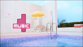
4Music is the second music channel I am going to compare. As you also see, it is not just a plain ident.It 's theme as you can see is summer, because of the pool and clear skies.
A suit of indents is different designs and clips or music for the same channel ident. Each one is linked by a different theme.They can have different types of audiences for example young people, or more for middle ages people. These themes could be important events going on in society or the the whole world such as Christmas. or just different seasons such as summer, spring and winter.Also they could have different indents for different times of the day, such as morning, midday or night time.
Most indents that are on in the morning tend to be more relaxing than exciting or fun, to match the mood of the viewer and for the midday it can be exciting and at night time more relaxed or can be more for adults as the shows and programmes change when it becomes late.
Different BBC one Idents
I am going to show you and explain the different types of idents for this particular Channel which is BBC one. During all year round the idents of BBC one change due to different events or different times of the year. Here are some different idents;

- Here as you can see is a Ident which relates to Christmas. In this ident you can see that there is snow and people dressed up in winter clothes, and many christmas trees. This would instantly remind the viewer that it is christmas and this makes the ident for the christmas period very successful.
- Here is a ident which relates to the London 2012 olympics. In this ident there is the famous olympics logo and this shows us that the BBC is going to be Broadcasting the games. This ident is very eligent and simple.
- This here is a sports related idents, there are many of these idents, and they change every year to refresh and keep the channel new and more interesting.
As you can they are similar to the size of the font and the colours, if you look at the first and third one, the font is the same but just layer out different due to the design of the indents, background. This has to be thought out because if there is a background that has the same colour as the font colour you would not be able to see the font, so they have to take this into consideration.
Two different music channel indents
I am going to choose two different music channel indents to how much information they are giving to the viewers that are watching the channel. How long they are on screen for, what the onscreen tempo is, how it interacts with the viewers and Whether it is information-led or entertainment led. These two channels are 4music and VIVA.
VIVA
As you can VIVA have chosen a very eye catching colour scheme in which if you were to see the colours again you would instantly remember VIVA. The pink and green colours have never been used before so this is a good way of getting noticed.
It does not give out much information but you will know it is for the music channel that they have. You can see that the slogan for the channel is 'up your VIVA'. This is a very catchy slogan that has been made.
This is successful because viewers will say it, and there for it is successful. This viva Ident is only on for a short amount of time, and during this time the channel tells the viewers what is going to be on next and on later.
4Music

4Music is the second music channel I am going to compare. As you also see, it is not just a plain ident.It 's theme as you can see is summer, because of the pool and clear skies.
Task 3 - Part 2
VIVA
As you can VIVA have chosen a very eye catching colour scheme in which if you were to see the colours again you would instantly remember VIVA. The pink and green colours have never been used before so this is a good way of getting noticed.
It does not give out much information but you will know it is for the music channel that they have. You can see that the slogan for the channel is 'up your VIVA'. This is a very catchy slogan that has been made.
This is successful because viewers will say it, and there for it is successful. This viva Ident is only on for a short amount of time, and during this time the channel tells the viewers what is going to be on next and on later.
Here is a VIVA Ident during the christmas of the year 2011. I am going to explain what is happening during it and if, in my opinion successful or not.
In this Ident as you can see It is aimed to be exciting and different. In this there are many lights that represent christmas and they also play heavy bass music to still remind the viewer that they are watch a music cannel which is VIVA. Also they show different types of programmes.
There are two different types of fonts that are used on this ident to start of with, on top of VIVA it says Flash your viva in a swirly type of writing,and in pink to stand out from the other text which is VIVA which is in a bold and capital font style.
The message of this advert is to remind the viewer that christmas is only round the corner. It is to get you exciting and as you can they've just done that. I think that it is successful because it gives out the right message that christmas is here.
This Ident is both information led and entertainment led because it gives you information on up coming shows that VIVA will be showing shortly and it is entertainment led because they have made it more exciting instead of the plain VIVA Ident that they would usually do,theres more to see.
Tuesday, 11 September 2012
An Introduction To TV Idents
On this post I am going to explain what a TV ident is and what it can gain and what it is used for.
Identifying the channel
An Ident usually comes on your TV screen before or after the programme. This occurs because during the time the Ident is on, it reminds the viewer what channel or show they are watching, and gives the viewer the knowledge of what the next show or whatever is on after. TV Idents mainly want to advertise their show, making it eye catching so the viewer would remember it. Here are some examples of eye catching Idents;
Creating the right tone and appealing to the target audience
Creating the right tone and making it appealing to the targeted audience is essential to making a successful ident. This will make the targeted audience interested in what the Channel or show has to offer them. By doing this the channel would make it trendy and eye catching in the theme of that particular age group, for example if the target audience was 16 - 20 year olds, it would be fun, colourful and not boring to watch. A successful ident would be one where which the viewer would not turn the channel over but want to watch more. Here is an Ident, as which you can tell is aimed at a younger audience, because of the use of colours and the Tv shows such as Doctor who which is aimed mostly at young people.
Packaging and Re-packaging a series of programmes or event
channels sometimes create a specific ident relating to a specific event or anniversary. They do this because it is a reminded of what is happening on TV, this can be a yearly event or once in a life time. i am going to show you a ident relating to Eastenders which marks its anniversary on air.
Organising the schedule (telling you what is on)
Telling you what is on is a very important thing that indents have to consider, because with using the ident to tell you whats on you can also warn the viewers of what the show contains and parental warning, , for example they could warn you that the film contains strong violence and sex scenes and that it would be unsuitable for any young children that would be watching. This can be helpful for anyone not wishing to view such things. The schedule is most important because it is vital that the schedules start and finish on time, and if the show finishes early the channel will show an ident to take up some time and to let the viewers know what is going on, and they mostly do this or if the show has finished late the channel will cut the advertisements down so the schedule can be back to normal and operating smoothly again..
Task Two – Understanding the limitations of the television ident
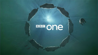 It is important that TV channels know the limitations of Idents and what they can do and what they can't do.This includes the colour the size and the content e.g, a channel cannot use a specific colour for there ident because another TV channel might be using that ident, for example BBC One can't use the colour purple because E4 use that colour as there trademark and identification.
 Different limitations
Content wise, the specific ident cannot use anything that could offend or upset anyone that might be watching it, so they have to be very careful when it comes to designing the actually ident and producing it. This could be any that could offend a group of people, such as race religion or any other group of people. Also channels have to take typography in to consideration.
Typography is the size or font style of the text or image. To ensure that the ident does not constantly change, throwing away the channels identification because if for example BBC One change there font, or the size of their text or image people would forget easily and therefor the ident would not be recognised and would be unsuccessful.

- This ident for BBC four is the main Ident which keeps the colours and the Font type and size. If the channel change any types of these features, they could not probably not be recognised by viewers that watch the shows on this particular channel.
- This is another example of an ident which keeps the same typography, the same colour and font type and size.
Aspect-ratio is important along side the others when it comes to the limitations of a television ident.
This is because the dimensions required to fit the screen depends on how big or small the viewers Television set is, because an Ident that would be to big on a small screen the ident would not be fully seen it could be cut short, or if the ident is to small on a big TV, it would be hard to view. So over time the ratio changes due to the fact that different Televisions are being produced and made.
- Here you can see that the screen is to small and that the aspect ratio is too small for the screen so they have put blank strips on the size to feel the gaps.
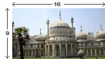
- Here you can see that the screen is to small as well, and that the measurements are wrong, so there is a widescreen on the screen
Adhering to a particular tone is very important and intact one of the most important ones listed. This means that the tone has to be suitable to what TV ident it is.
Subscribe to:
Comments (Atom)



,+our+lead+dancer,+and+pulls+back+to+reveal+three+basketball+players+dancing+in+their+wheelchairs+to+a+hip-hop+theme+on+a+stunning+basketball+court.jpg)


