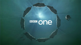
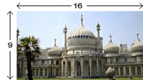
 It is important that TV channels know the limitations of Idents and what they can do and what they can't do.This includes the colour the size and the content e.g, a channel cannot use a specific colour for there ident because another TV channel might be using that ident, for example BBC One can't use the colour purple because E4 use that colour as there trademark and identification.
 Different limitations
Content wise, the specific ident cannot use anything that could offend or upset anyone that might be watching it, so they have to be very careful when it comes to designing the actually ident and producing it. This could be any that could offend a group of people, such as race religion or any other group of people. Also channels have to take typography in to consideration.
Typography is the size or font style of the text or image. To ensure that the ident does not constantly change, throwing away the channels identification because if for example BBC One change there font, or the size of their text or image people would forget easily and therefor the ident would not be recognised and would be unsuccessful.

- This ident for BBC four is the main Ident which keeps the colours and the Font type and size. If the channel change any types of these features, they could not probably not be recognised by viewers that watch the shows on this particular channel.
- This is another example of an ident which keeps the same typography, the same colour and font type and size.
Aspect-ratio is important along side the others when it comes to the limitations of a television ident.
This is because the dimensions required to fit the screen depends on how big or small the viewers Television set is, because an Ident that would be to big on a small screen the ident would not be fully seen it could be cut short, or if the ident is to small on a big TV, it would be hard to view. So over time the ratio changes due to the fact that different Televisions are being produced and made.
- Here you can see that the screen is to small and that the aspect ratio is too small for the screen so they have put blank strips on the size to feel the gaps.

- Here you can see that the screen is to small as well, and that the measurements are wrong, so there is a widescreen on the screen
Adhering to a particular tone is very important and intact one of the most important ones listed. This means that the tone has to be suitable to what TV ident it is.


No comments:
Post a Comment